Creating a foam board flat for a medieval Stockholm
I’m always on the lookout for suitable terrain to have in photos and this time I needed something to represent medieval Stockholm.
This is not an Ikea joke but a way of making a cheap, fast and nice looking coulisse - or flat - for photos.
A couple of years ago I had a some buildings commissioned from a guy with the internet-name of Wikkywok. I had seen some of his work in the Battlegroup rules and by following Piers Brand's different projects and battle reports over a number of forums and sites. In short he creates beautiful buildings by glueing realistic house facades onto foam board. It’s much more to it than that but that’s the basic principle.
One of the houses that Wikkywok made for me. It looks fantastic but unfortunately the project it was made for, a modern setting with a Russian incursion into a neighboring country, just isn’t something I find fun anymore for obvious reasons.
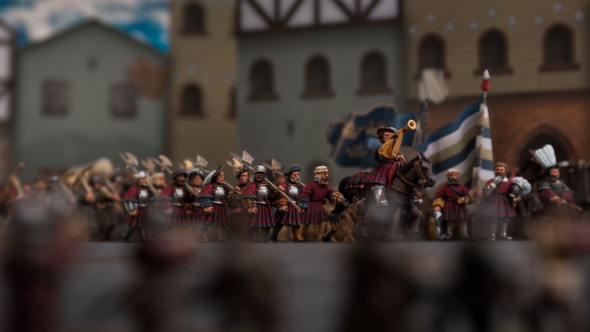
As I was thinking about what type of image I wanted to accompany this article about Gustav Vasa's Lifeguard I thought it would be nice to have them march through the streets of Stockholm. The problem with that was that I had absolutely no buildings suitable for that. Then I remembered Wikkywok’s buildings and realised I could do something similar. It wouldn’t be a full house and not the kind of detail as in his house, just the facade - a coulisse.
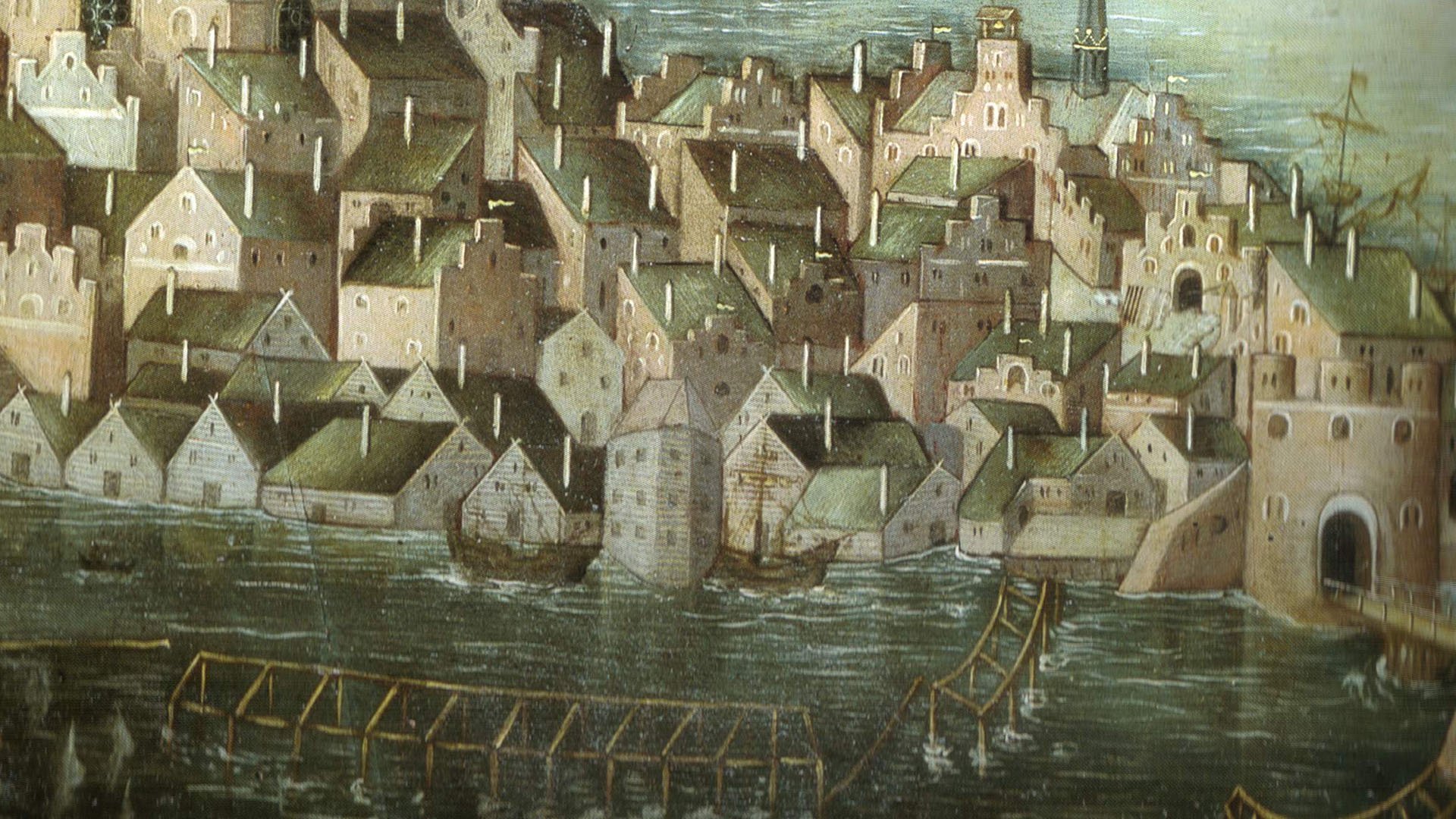
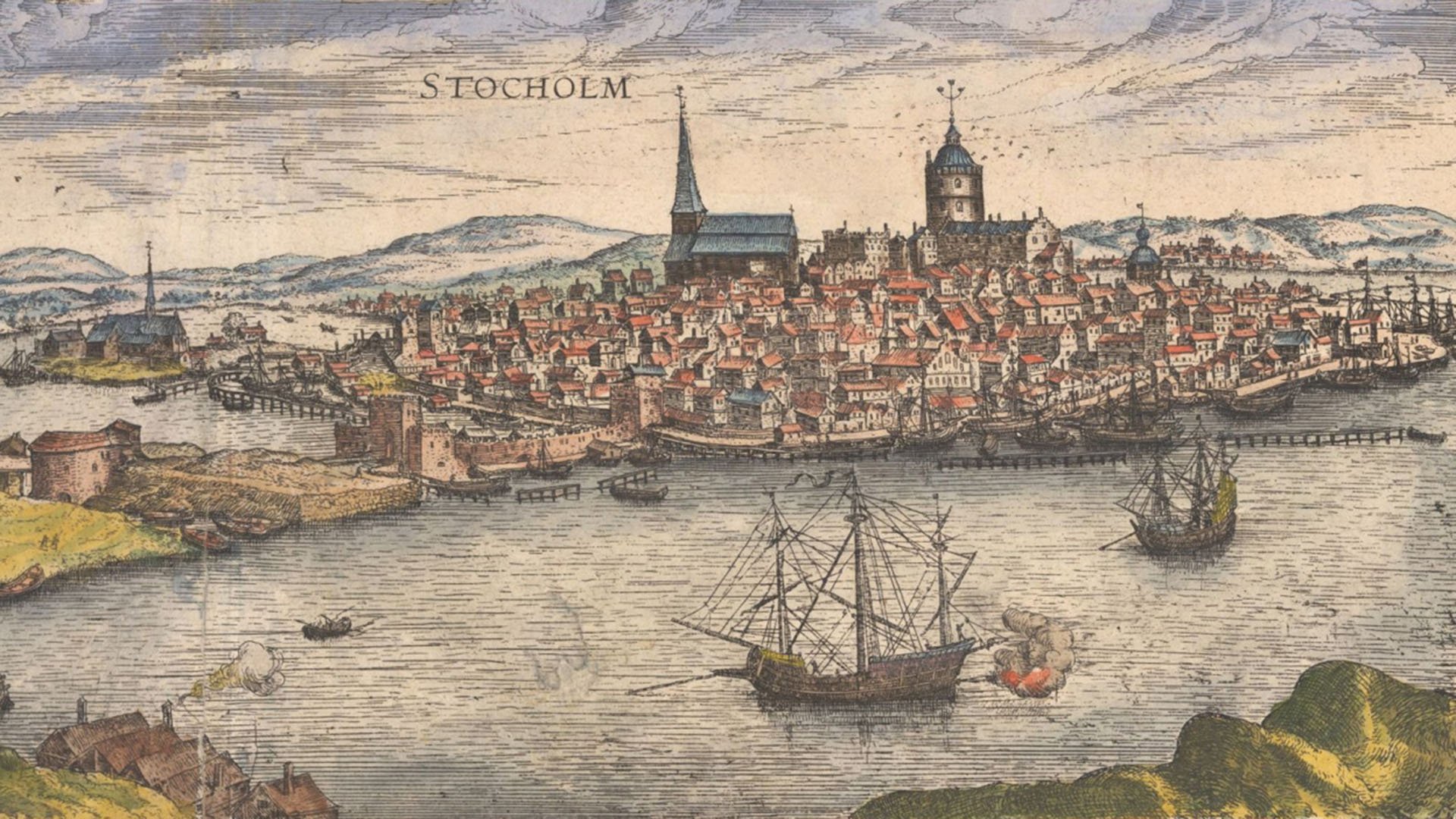
There is not a wealth of pictorial sources on Stockholm in this period but one is Vädersolstavlan, the Sundog Painting, from 1535. The painting depicts a halo phenomenon but is most famous for its portrayal of Stockholm. A couple of decades later, sometime in the 1560’s, a Dutchman named Franz Hogenberg made an engraving of Stockholm for a book portraying cityscapes in Europe. Both of these images offer a birds eye view of Stockholm at the time and we get some of the general shape and colour of the buildings. It would have been nice to have a street view of the city but there isn’t any so we’ll have to guess some of the finer details.


I opened up Adobe Illustrator and sketched out four buildings in some of the shapes from the paintings. For measurements I used buildings from Sarissa Precision as a guide. A building was 10 centimetres wide, a floor was 7 centimetres tall, a door was 4,5 centimetres tall and so on. Then it was time to find the textures I needed. I searched on search engines and stock image sites for things like ”brick wall”, "concrete surface”, “log house” and so on.. These were then downloaded and I opened them in photoshop. Here I could manipulate them to fit what I needed. Mostly I made them larger, lowered the exposure and increased the contrast. These textures were then brought into Illustrator and cut to size to fit the buildings. For the concrete texture I could then add colour above and thus create coloured facades. Brick and wood was mostly used as it is.
Here is a close-up of how the houses look when they are done in Illustrator. The details are quite rough as you can see.
I then proceed to scour the internet for images of suitable doors, windows and other useful things. These were downloaded, opened up in Photoshop and “cleaned up” as best as I could. Backgrounds were removed, odd parts were fixed, colours were tweaked and just like with the textures I lowered the exposure and increased the contrast. These were then saved as separate files and brought into Illustrator. They were placed and scaled so they fit the building and then I used different blending modes to make it look more realistic. Some elements that would have protruded out from the wall were given a shadow obliquely from above. Some were given a simple light drop shadow to help them fit into the background texture. I also added various details like cloth hanging from the windows, embedded stones and metal bars and shadows within the windows. I tried to make it look as 3d and “real” as I could even though I know that most of the details will not be visible in the end because of the background blur of the photo.
Once the facades were finished I printed them on A3 paper which I glued to black foam board. Then I cut out the houses using a sharp modelling knife. I cut small triangles from some of the leftover parts and glued these as stands at the back of the foam board.
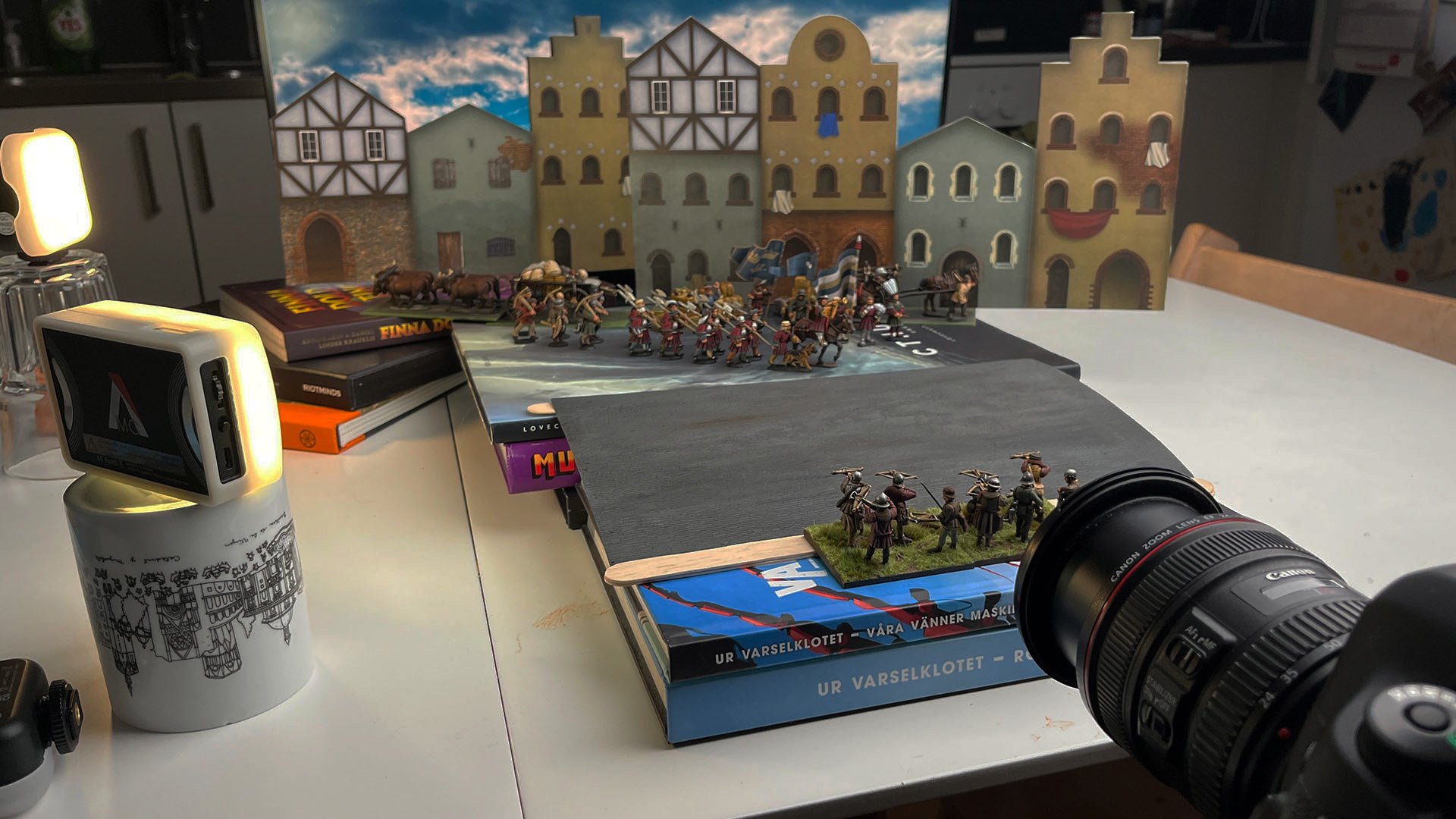
I set up for the photo as shown below. As usual the whole scene is at an angle towards the camera and I aligned the closest coulisse to that. When drawing this building I knew I wanted it like that and that the light would be coming from the right and thus all the shadows on the buildings are angled to reflect this. In the end it’s very subtle in the image, barely noticeable, but if they were angled the other way it might have looked weird. The coulisse in the back was angled slightly the other way but I was careful with this because here you would be able to see the tops of the houses. I was afraid this house would look too flat or even hollow if I angled it too much so kept it looking fairly straight on to the camera.


I think I’ll continue to develop these types of backdrops or coulisses as they were fairly easy to make, cheap and look convincing in the photo. I probably spent two nights creating the images for the houses and another hour for the glueing and cutting. The sheets of foam board cost 3-4 pounds or euro each. Definitely faster and cheaper than if I would buy and paint proper wargaming buildings, although I arguably get less use out of these. I already have plans of cutting out the windows to add miniatures in them or perhaps lights. You could also add balconies or other similar features to make them look more 3d so I think these will show up in a few more photos in the future.
A note on the software I use
I use Photoshop and Illustrator quite a lot here and they are both necessary and expensive. I am fortunate to have a job which gives me access to this software. I know there are cheaper and even free programs which are similar but I am not familiar with these. Many of the images I used for the houses were not royalty free so I can’t offer a download of the images. If there is enough interest I might do new ones with proper images though so these could be downloaded.


This is not an Ikea joke but a way of making a cheap, fast and nice looking coulisse - or flat - for photos.